
5 Key Stages of a Successful Web Design Process for Increased Conversions and Engagement
The practice of web design has seen a flurry of innovations during the years. It has touched everything from the tooling of site-builders to the ability to use cloud services. And, of course, the promise of steering more site traffic by using social media.
During this age of digital transformation, web design has stayed near the top of trending topics. However, for all the buzz and server farms dedicated to the cause, little has been said about how those of us in the practice may bring various participants into the fold of a tried-and-true process that always gets the strongest results.
This blog article is just a slice of our own effort—beyond our variety of web-related services—in filling that gap just a bit more every day.
What Is a Web Design Process?
A web design process for any product or service design entails a few distinct stages that drive the successful delivery of your web-based offering from beginning to end.
At a basic level, these stages will involve three core activities that transition or mature over the course of a web design. Those activities are to fact-find, frame the solution and deliver the solution.
A design process simply articulates what outcomes these activities must target during every stage.
Outlined in the graphic below, we propose five key stages for directing or overseeing necessary due diligence to produce (literally) any web design process that will stand the test of time.
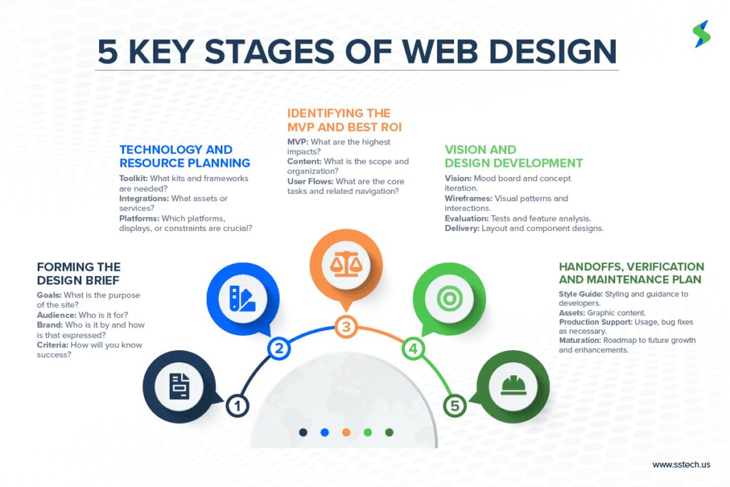
The following are the 5 key stages for a successful web design process in some detail.
1. Forming the Design Brief
So, you’re building a new website. Or, heaven forbid, you’re having to revamp an existing one. Either way, you will want a dashing modern design to make the entire effort worth it.
But where do you start? Well, it helps to know exactly what you want each new user to come away with after visiting your site. What do you want the content to communicate? What calls-to-action are needed? These focal points must be sorted out so you can create a design that fully addresses them.
Next, you will want to document these focal points in the form of a design brief—one that your team can keep for reference throughout the process.
Your website must help fill the gap between what customers know and what you wish they knew about your organization and its services or products.
Your design brief also must include a statement of self that centers around your brand’s identity. A website can’t be a lone outpost on your digital frontier. Instead, it must fit into a brand’s broader strategy. Therefore, it needs to complement this strategy and add its own value to increase engagement and conversions.
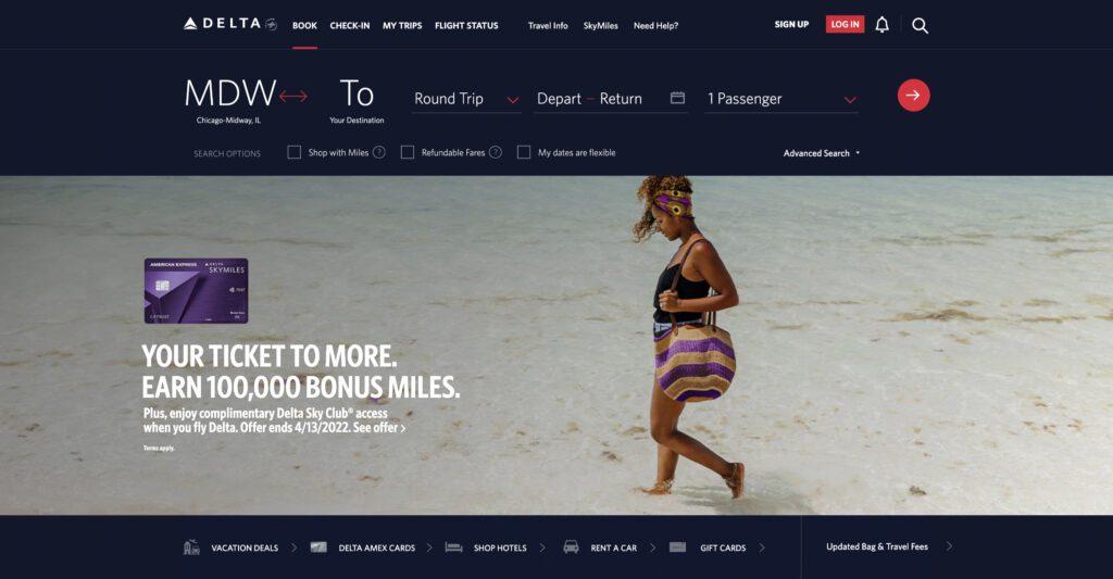
A good example is Delta Airlines’ website, which makes significant use of a brand-based color palette and has easy-to-read typography to deliver a clean user experience. It also happens to be remarkably easy to navigate. These factors lead to a booking experience that effectively promotes the company because its approach intimately ties the brand to a unique and stress-free experience.
Your definition of scope and criteria are essential components of any web design project. And they can be used to chart all your critical milestones.
Meet Client and User Needs
Additionally, a solid understanding of the site’s target audience will help inform all your design decisions. By crafting personas, your product team can gauge the answer to one of their most crucial questions: Who are the critical users we must reach for this to be a success?
By estimating your users’ expectations and day-to-day motivations and then documenting those in your user design brief, you can be confident your solution will satisfy user needs.
Finally, another crucial aspect for your product team is how to measure success using metrics.
Ideally, you must consider all the specific metrics you will need to track across your website to get the most relevant insights. Would that include your traffic of unique visitors? Sales transactions? Session times? Rates of retention?
Identifying all these goals early during the design process can help you make informed decisions to meet both the client and user needs. Using a tool like Elysium Analytics can help you easily and accurately measure your most important metrics.
2. Technology and Resource Planning
Once you know what success can look like, along with who and what your site stands for, it’s time to figure out your tools for getting there.
When it comes to the look-and-feel of a user interface (UI) implementable to your website, a toolkit can determine a range of constraints and opportunities. So, it helps to wisely pick that toolkit.
You can go the route of a full-fledged framework with an available suite of templates, themes and components for site-building. But that may box you into a narrow set of options.
The alternative is to select these elements (or even build them) on a case-by-case basis, as they best fit your goals. Invest some time to review what’s available and catch up on the latest standards and best practices for forming a well-built site using your web design process. Your users’ first impression—especially on the quality of your offering—may depend on it.
Aside from impacts about look-and-feel, you want to consider all factors that will make your site easier or difficult to support. Aspects, such as your tools for content management, third-party integrations, customizable APIs and technical support that may or may not be provided.
Finally, you will want a site that also performs where it’s needed, whether platforms or devices. And nowadays, it really can spell doom to adopt a framework that’s unresponsive right out of the box. For a responsive design, let your tooling match your ambitions.
3. Identifying the Minimum Viable Product and Best ROIs
Speaking of ambitions, it’s also good to define what the minimum viable product (MVP) for the site will be and orient the sitemap around enabling that deliverable. Finding this is completely based on your site’s specific set of goals and intentions, as outlined in your design brief, so any web-based MVP can take many forms.
But we’re talking about the one feature, resource or call-to-action (CTA) likely to deliver the highest ROI for building the site. So, it makes sense to primarily orient your content plan and functionality around the site’s MVP, while also ensuring everything from the site’s navigation to the placement of input fields works to support the same.
Having these reflected in a sitemap will provide you with a skeletal framework of content and structure. Plus, it’s an opportunity to guide the taxonomy of your site’s verbiage, including navigation labels, page titles and headers. Hierarchically laid out by intended architecture, such an overview is good for assessing specific visuals you may need produced (or acquired), along with any assets, that bring the content to life.

SEO and Accessibility Factors
Crucially, you will also want to consider the site’s SEO and accessibility factors. Depending on your site’s greater aims, it can make all the difference to its ultimate impact and how it performs against direct competitors. Helping your users find you helps you to find them and enables better models and predictions through site analytics.
With a gameplan for your site’s structure and how it’s centered around the MVP, makes it easier to connect the dots of interaction that flow from the user to the system and back again in the form of features and services, per the use cases in the design brief.
Such a user flow is valuable to shape the overall usability of your site. It helps set up major navigation schemes and accounts for any bigger, unforeseen barriers. At the same time, it creates the chance to figure out the features that especially add value along the user journey. Features that tend to benefit from a strong web design.
4. Design Development
Any website that exemplifies useful design starts with a clear and inspirational vision. A mood board is a wonderful way to approach that visualization. As a digital collage, it helps define the visual direction of your site. It can be considered an abstract or creative version of your design brief. And its purpose is to gather ideas and inspiration before you jump into any real design work. It will help you decide, for instance, what your overall mood or tone is. Will it be lighter or darker? Professional or playful? A mood board helps piece this together.
The wireframes that follow can be considered a blueprint for your screen designs. As such, they’re as valuable as any other form of blueprint.
They also serve as the first skeletal representation of your site or application’s layout, incorporating the best available insights from customer journeys, user needs and core workflows.
Most importantly, wireframes can be used to confirm the product or service by helping evaluate form factors, inviting feedback and road-testing design ideas before getting into finer details.
This brings us to another design activity that, ideally, precedes detailed design work: Doing some level of validation on the overall web design process from the site’s key stakeholders.
User Testing
Any more critical aspects, however, must also involve potential user testing, with end users successfully recruited for direct feedback about the MVP. And especially where that is or isn’t being supported by a given approach. Leadership and product owners will want to verify that the evolving solution is compelling, effective and competitive as compared against other offerings in the same space.
Only then, after knowing what revisions will produce the strongest, overall package for your site, will it be the best time for designers to invest all-in at the detail level.
The clearest goal of the last phase of design development is to produce a near-final representation of your intended design. High-fidelity, interactive wireframes are a useful way to achieve this, while fleshing out the remaining design details.
Additionally, they’re key to communicating in a tangible way to stakeholders critical features, functionality and styling. A well-crafted wireframe will also be effective at proving how well the site design has addressed various aspects of usability.
Crucially, this deliverable works to embody the final vision of your site in the most presentable way before shifting efforts to support the site’s technical transformation into a coded, web-based product.

5. Handoffs, Verification and Maintenance
After the design team has gone from concept to finished design, the next practical milestone is to execute an efficient handoff to developers. These handoffs have the potential to leave design items “lost in translation” if not done in a careful and systematic way. And this carries the risk of a developer not getting the necessary details, leading to a poor user experience.
Therefore, a successful design handoff is extremely important. Fortunately, there are several popular hand-off-enabling tools that can help. Figma, Adobe XD, Zeplin and Framer are fitting examples to name some.
As part of the handoff to development, style guides are used to help keep the visual identity of your interface consistent by packaging the same guidance and properties in one resource. They can be beneficial internally to your team and externally to any current or future collaborators.
Most importantly, style guides help streamline the transition to implementation. Ideally, designers and developers are in regular communication with each other. However, if designers can also deliver a comprehensive style guide for your site or app to developers, they will have an easier time implementing an entire range and pattern of elements into code.
Finally, the best implementations feature a series of demos. These actively verify the end user experience as it takes form. And all within the living, breathing production environment your site call’s home. You will absolutely want to account for this in the delivery schedule. And building-in enough slack to address inevitable bugs. And this combines the chief concern of verifying all content and assets as rendered on the implemented site design.
With these signed off by the client and relevant stakeholders, the last place you’d like any surprises is on the final product.
Conclusion
By following the basic steps during these five key stages of the web design process (Design Brief, Planning, MVP, Design and Handoff), you can produce a great site design ready to ship for production. (Congrats!)
But does it really end there? That depends on whether you’re willing to count on perfection, as in a perfect design, perfectly translated in a perfect implementation that stands the test of time. Let’s be real. You’re better off counting on the next best thing. That is, using these stages as your north star to keep enhancing or keeping up your site for long-term success. Expect many lessons learned and lots to build on, too.
Your immediate concern is: How do I deliver my site design at the necessary speed, under necessary cost and with necessary talent to not only meet, but exceed, all expectations?
Well, we may just have the digital service you need. Whether you quickly need a solution, as fast as a 90-day turnaround, with flexible pricing, the right talent or all the above, a trusted Digital User Experience (DUX) partner like System Soft Technologies can help.
System Soft strives to build long-term partnerships. It’s our passion to create the most impactful experiences you can imagine. And use the best and most proper skills to execute your vision. Contact our team to learn more about our DUX process and services.
About the Authors

Paanii Ansah-Kofi serves as a Senior UI/UX Designer at System Soft Technologies. Paanii employs an architectural approach to user-centered design. He has many years of experience developing interface designs for SaaS, web and hardware applications. His background in building design systems and using Agile collaboration have helped clients scale their solutions and make better decisions about how to scale those solutions.

Kranthi Janjarla serves as an Associate UI/UX Designer at System Soft Technologies. A proficient solver of design problems, scattered design makes Kranthi uncomfortable. He believes a simpler design supplies a more efficient way to live. His design practice combines design thinking, user research and experience strategy—all with a focus on the user.